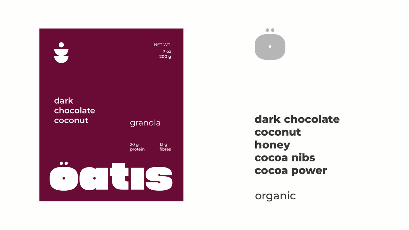
OATIS
The process of developing the Oatis logo was a journey of creativity and precision. It began with a deep exploration of the brand's identity and the message it aimed to convey. Oatis wanted to express the idea that their granola is not just a breakfast option but a delightful experience, offering surprising and unusual flavors that awaken the senses.
To bring this concept to life, I've focused on simplicity and lightness, two key elements that define Oatis granola. The logo design had to be more than just an image; it needed to be a visual representation of the company's ethos. The deliberate emphasis on the letter 'O' within the logo is masterfully designed to evoke a range of emotions. it represented a sense of completeness and unity, while the circular shape alluded to the wholesome and natural qualities of the product. The carefully crafted logo embodies the company's core values of stability, simplicity, and clarity.
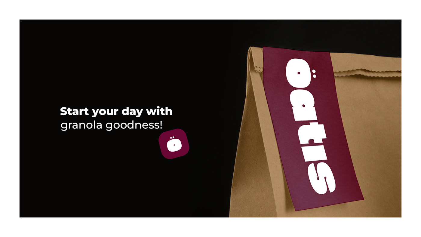
Upon unveiling the new logo, Oatis received an overwhelmingly positive response from both their loyal customers and newcomers. The logo became a symbol of their dedication to creating surprising and delightful granola experiences while emphasizing simplicity and lightness, a perfect reflection of the heart and soul of the Oatis brand.